Week 2
Introduction to the Grammar of Graphics
Discussion
Reading: The Age That Women Have Babies
Get into groups of 2-3 people and discuss the following questions:
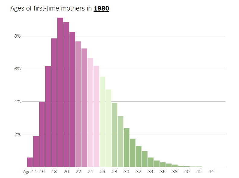
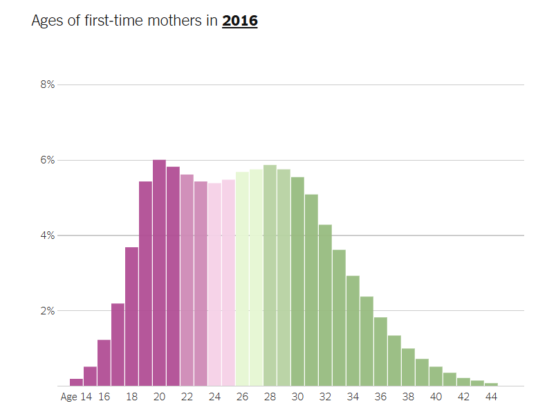
- What is something you like about the way this data is portrayed?
- What is something you would change in these visualizations?
- What data does the percentages on the vertical axis represent?
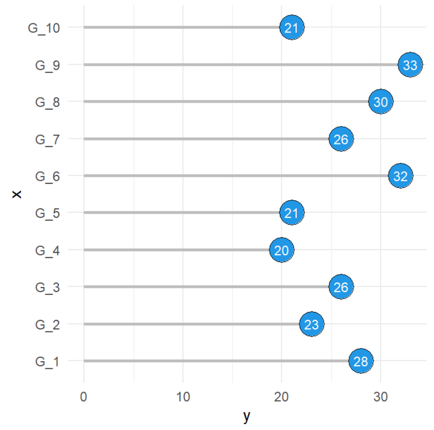
Lollipop Chart
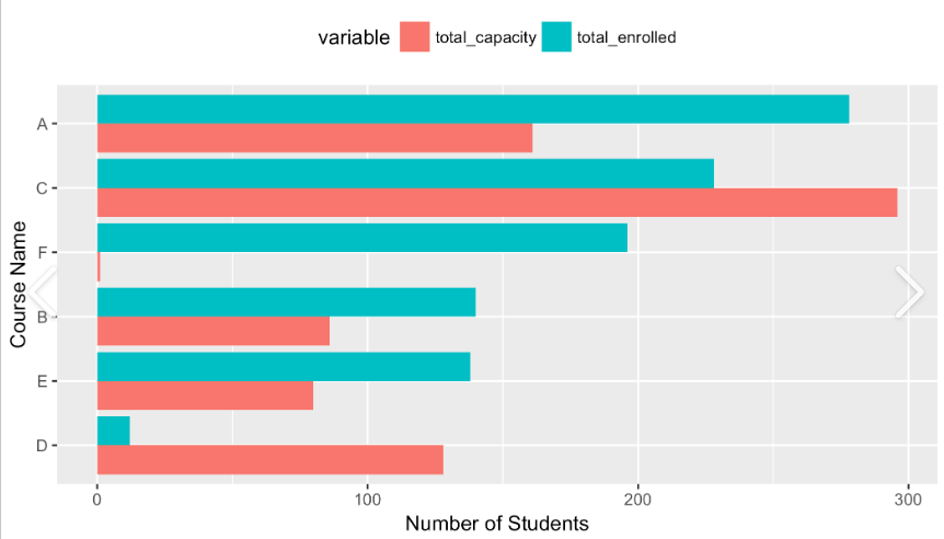
Sorted Bar Chart
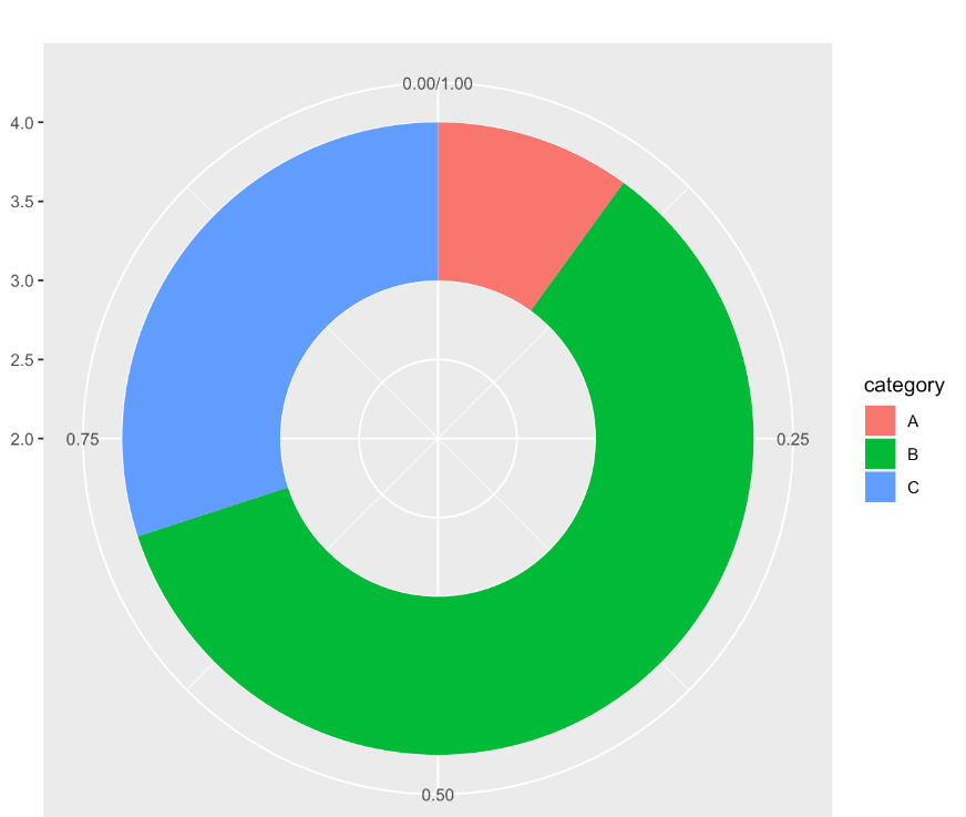
Donut Chart
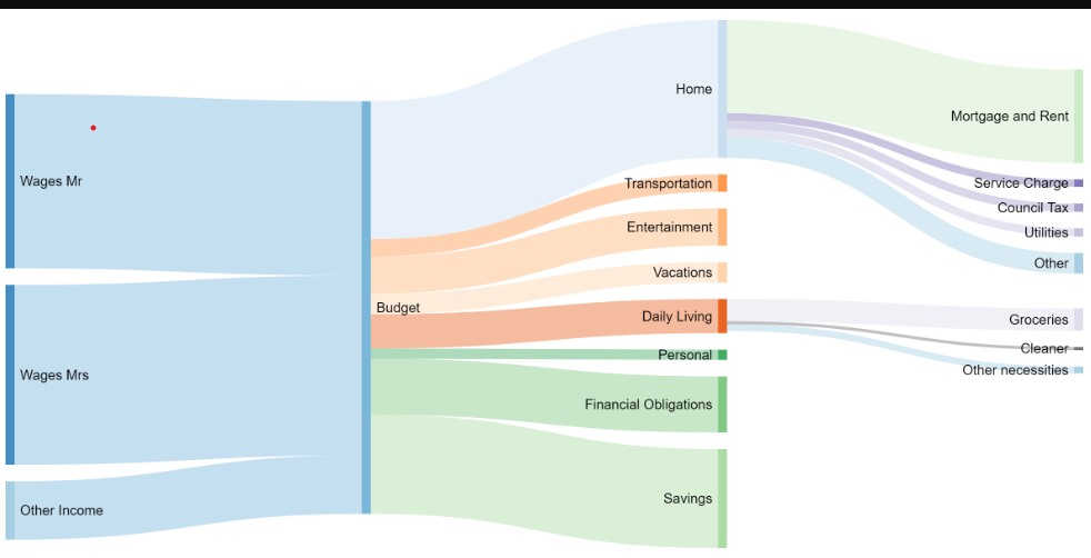
Sankey Diagram
Formalized by Leland Wilkinson (1999)
- A formal set of rules to create any type of graphics
- Underlies most modern data visualization software.
- Implemented as an R package (‘ggplot2’)
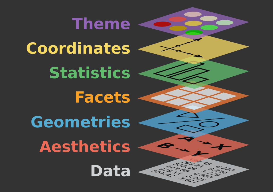
Key Concepts
- Data: the data set being visualized (next week!)
- Aesthetics (aes): how variables map to visual properties (x, y, color, size, etc)
- Geometric objects (geoms): what kind of marks to draw (points, bars, lines)
- Facets: creating small multiples by splitting data into panels
- Stats: statistical transformations (e.g. binning for histograms, smoothing lines)
- Coordinates: how data values are translated into visual values (e.g. color gradients)
- Themes: controlling non-data elements (fonts, backgrounds, gridlines)
Aesthetic Mapping
An aesthetic mapping links a variable in the data to a visual channel that can encode its variation.
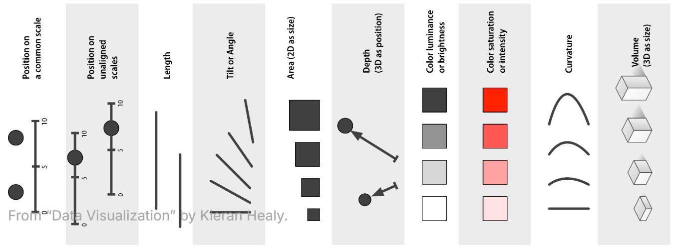
Channels for ordered variables
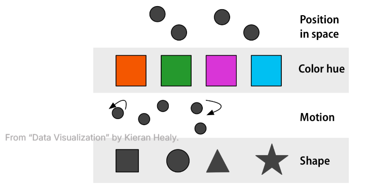
Channels for unordered variables
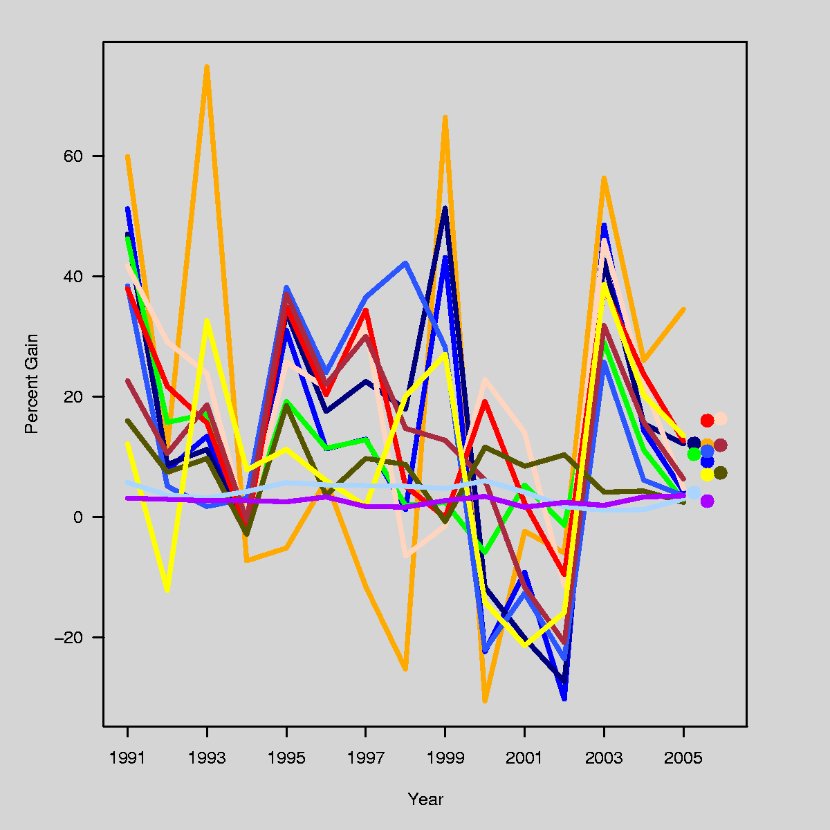

Code Example
Here’s an example of code and output using ggplot2 in R.
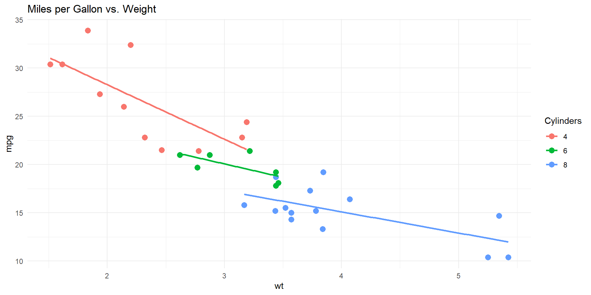
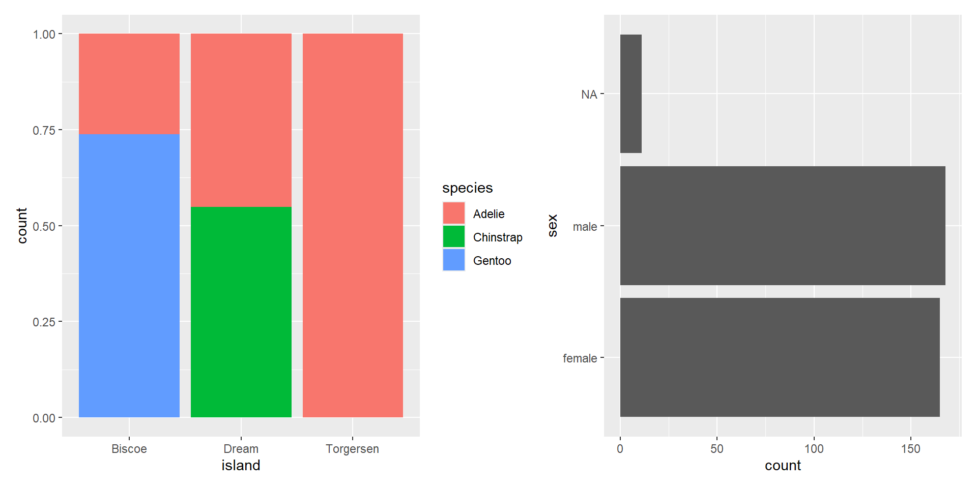
Question: In terms of the way they are constructed…
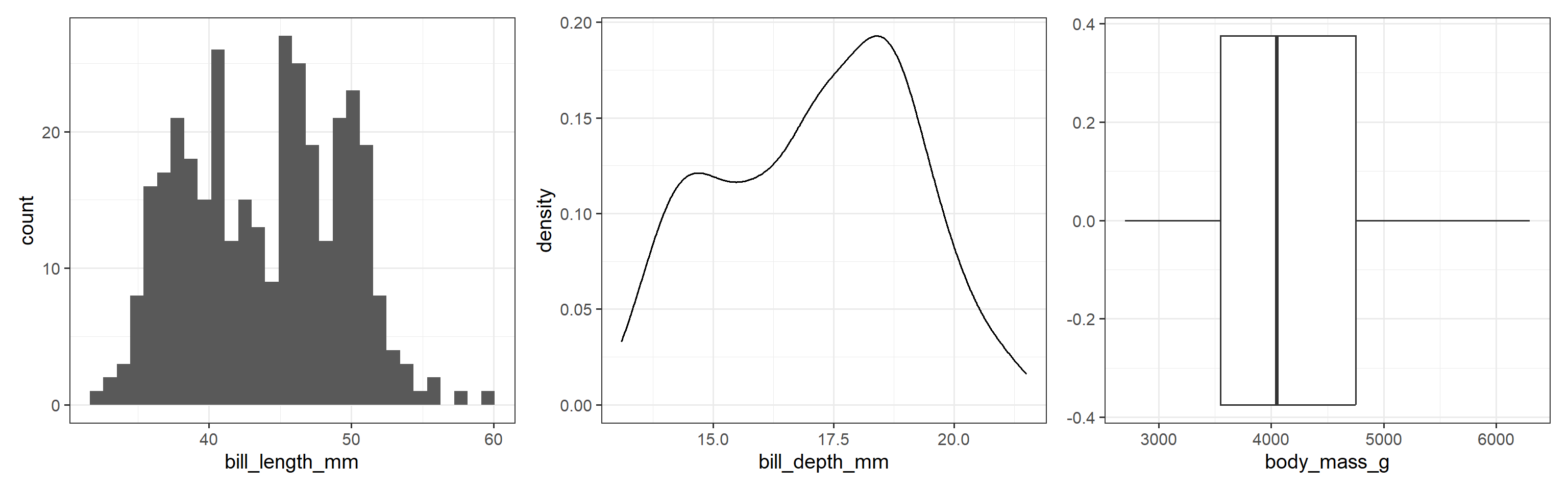
What do these plots have in common? How do they differ?
01:20
Question: What do these plots have in common? How do they differ?
01:20
Question: What are the aesthetic mappings and geometries used here?
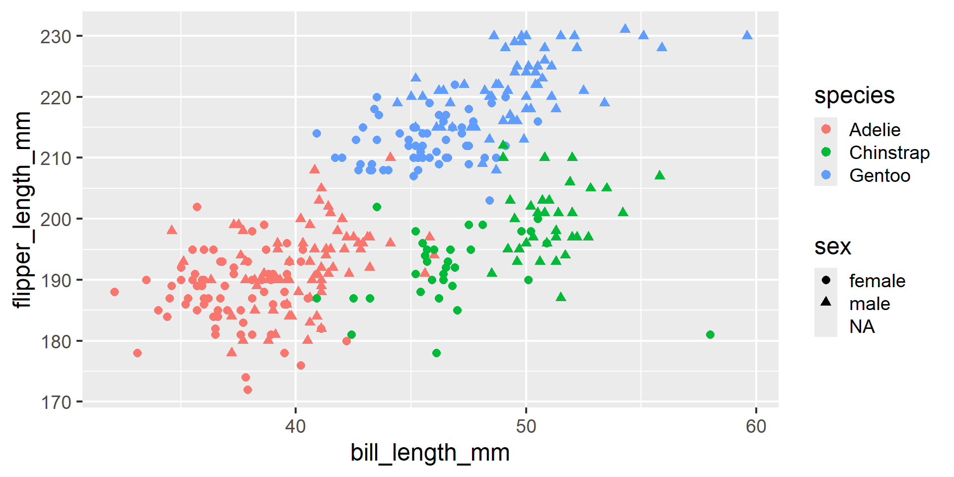
01:30