# Recall our farm data:
library(tidyverse)
farm_data <- tibble(
  employee_id = 1:10,
  hours_worked = c(40, 55, 38, 60, 45, 50, 42, 65, 37, 48),
  seasonal_worker = c(TRUE, TRUE, FALSE, TRUE, FALSE, TRUE, FALSE, TRUE, FALSE, FALSE),
  supervisor = c(FALSE, FALSE, TRUE, FALSE, TRUE, FALSE, TRUE, FALSE, TRUE, FALSE),
  commute_min = c(15, 35, 20, 50, 10, 40, 25, 60, 12, 30),
  primary_crop = c("Corn", "Wheat", "Corn", "Soy",
                   "Soy", "Wheat", "Corn", "Soy",
                   "Corn", "Wheat"),
  years_experience = c(2, 5, 10, 3, 12, 4, 8, 1, 15, 6),
  hourly_wage = c(18, 20, 25, 19, 28, 21, 24, 17, 30, 23)
)

farm_dataWeek 4
R Basics (3) - EDA and ggplot2
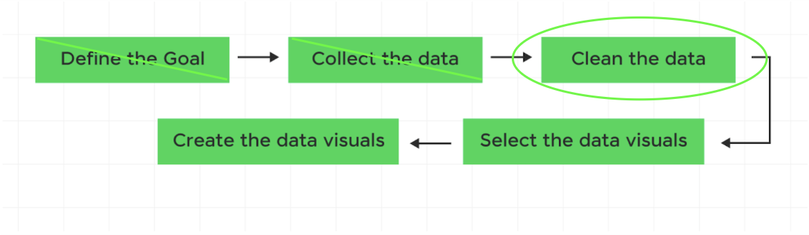
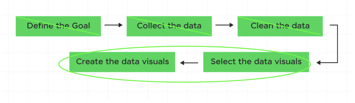
Reminder of DataViz Workflow

Reminder of DataViz Workflow
Q3: What is the distribution of years_experience?
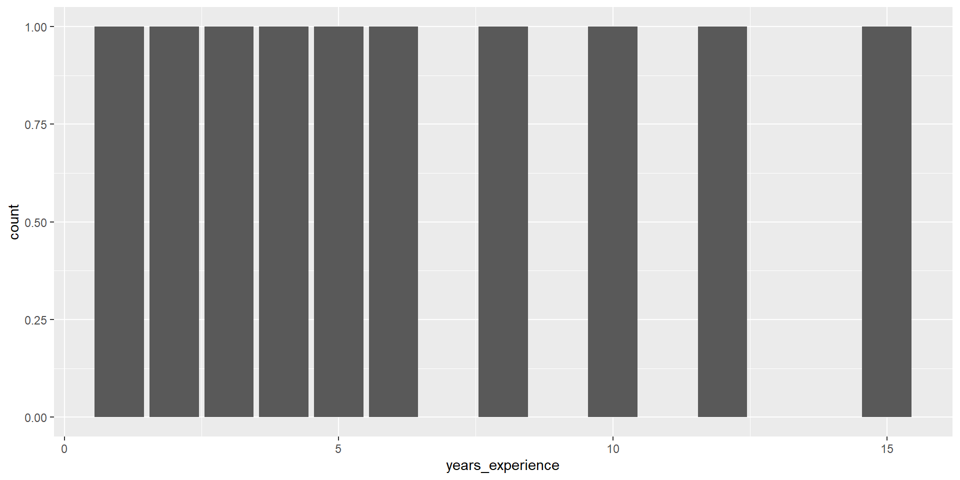
Q3: What is the distribution of years_experience?
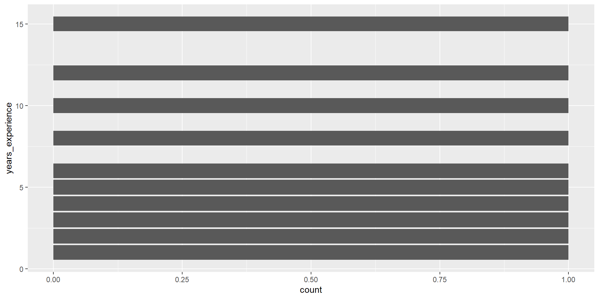
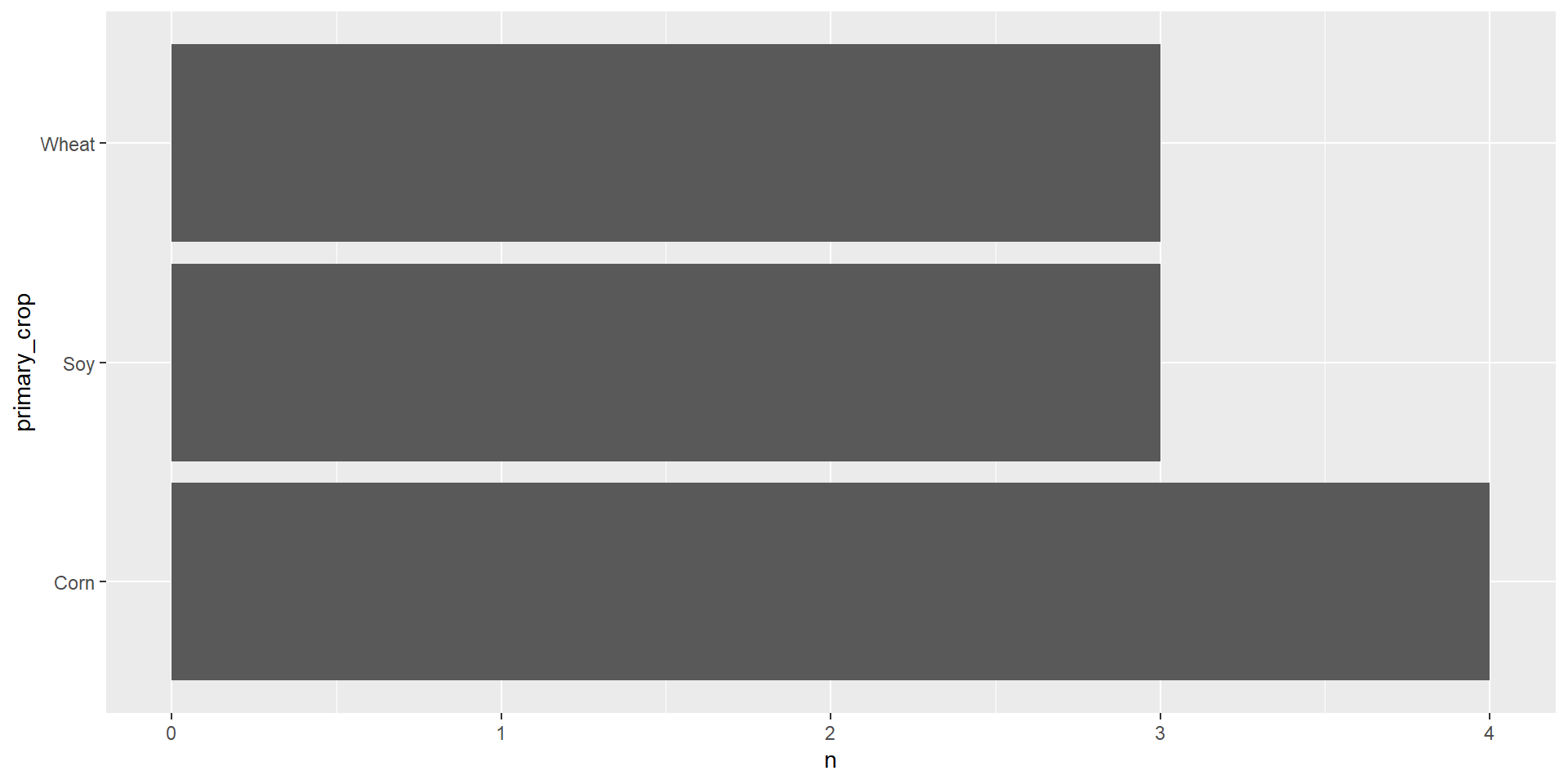
geom_col()
geom_col() takes one column of categories and draws a bar for each up to the height of a second column of counts.
Reminder of DataViz Workflow
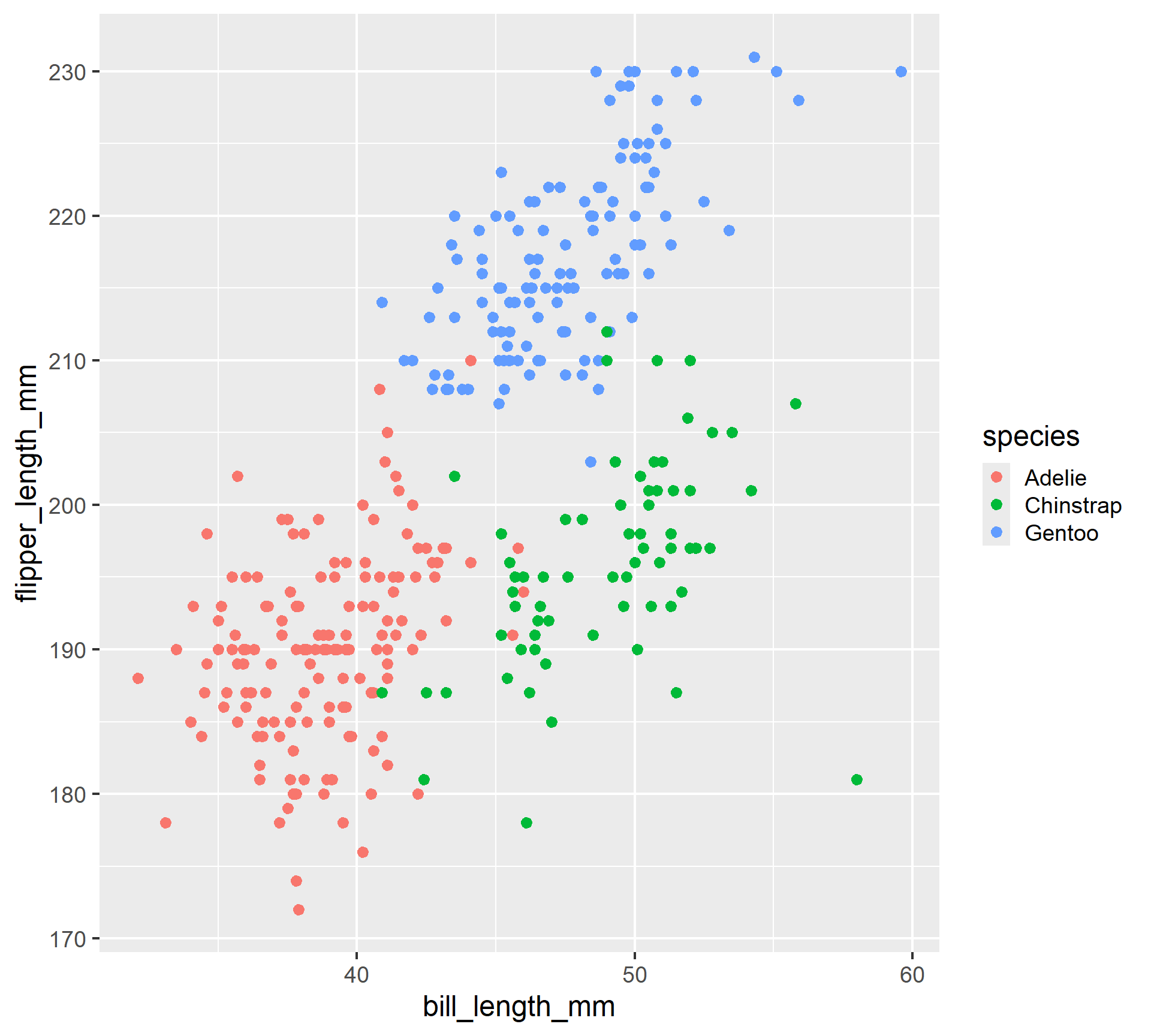
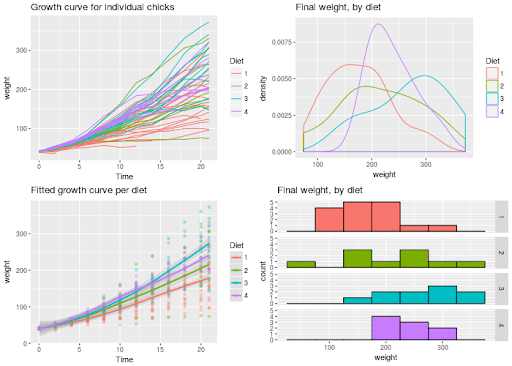
Examples of graphs we can make with ggplot2
# A tibble: 344 × 3
   bill_length_mm flipper_length_mm species
            <dbl>             <int> <fct>
 1           39.1               181 Adelie
 2           39.5               186 Adelie
 3           40.3               195 Adelie
 4           NA                  NA Adelie
 5           36.7               193 Adelie
 6           39.3               190 Adelie
 7           38.9               181 Adelie
 8           39.2               195 Adelie
 9           34.1               193 Adelie
10           42                 190 Adelie
# ℹ 334 more rows