What role does the subtitle of the visuals play? What would you add/remove?
How do the labels, captions, or notes help you interpret the graph?
In what ways do the graphs differ? Consider the context, data, subtitles, description, etc.
Why Color Matters in Data Visualization
Color is one of the most powerful visual tools in a graphic.
It helps us distinguish groups, highlight patterns, and encode information.
But before deciding how to use color, we need to understand what type of data we are visualizing.
In visualization, data typically falls into two main categories:
Main categories
Categorical (Qualitative) – represents groups or labels
Demo
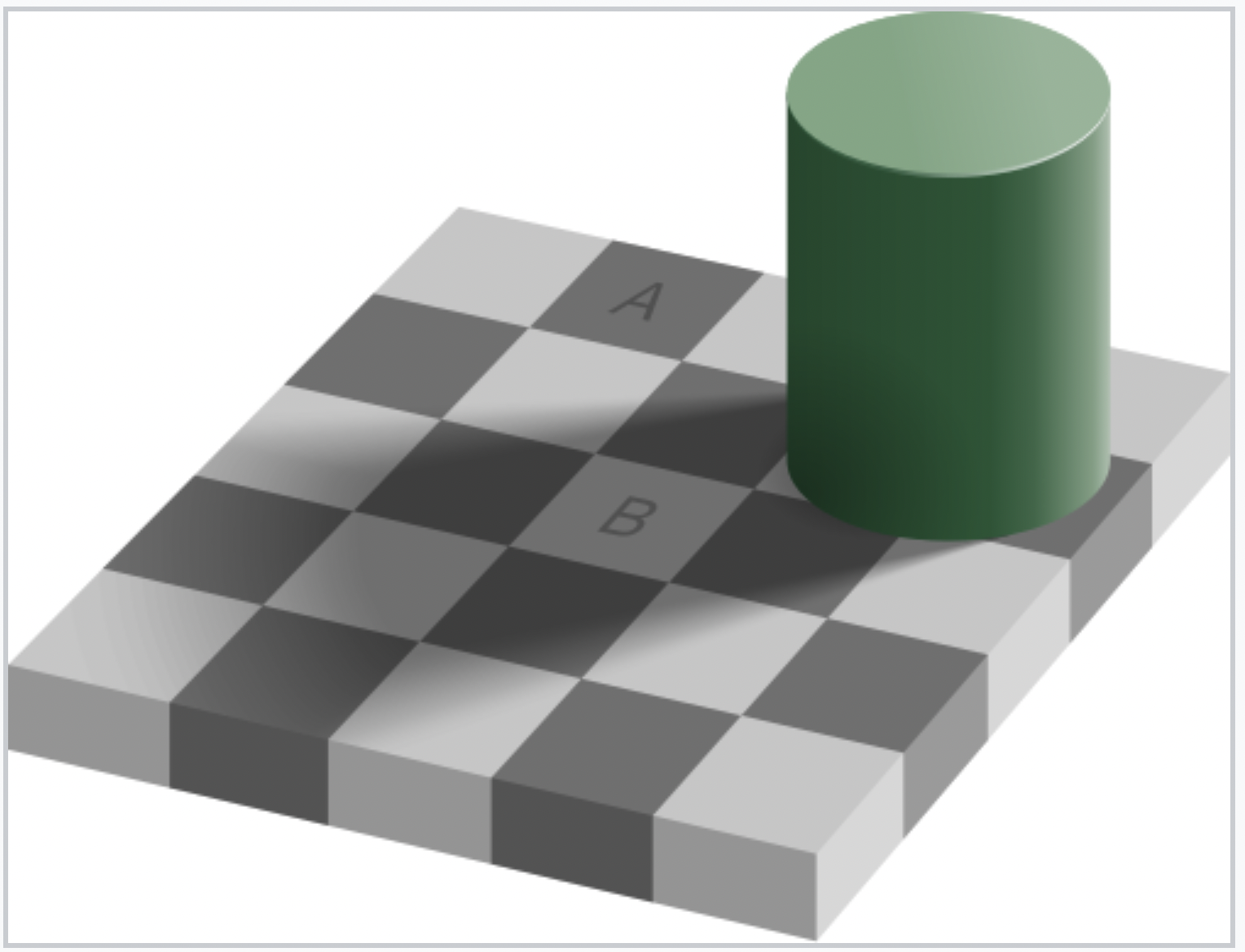
This famous illusion demonstrates that our perception of color is influenced by surrounding context. Even when two squares are the exact same color, our brain interprets them differently because of lighting and shadow.
If color is not chosen carefully, viewers may misinterpret differences in the data.
Why Color Choice Matters
Human color perception is relative and context-dependent.
The Adelson Checker Shadow Illusion shows that the same color can appear different depending on its surroundings.
In visualizations, non-uniform color scales (like rainbow) can distort patterns:
Some transitions appear more dramatic than others
Middle values may seem more important due to bright colors
Choosing the right color scale is critical for accurate data interpretation.
Let’s Look at ColorBrewer
We will use ColorBrewer as a tool to explore different color palettes designed specifically for visualizing different types of data. ColorBrewer Website ColorBrewer organizes color palettes into three main types:
R base color palettes: rainbow, heat.colors, cm.colors.
Warning: not all palettes are perceptually uniform!
Perceptually Uniform Color Scales
Perceptually uniform scales ensure that equal changes in data correspond to equal visual differences in color.
Benefits:
- Accurate data interpretation: patterns are represented faithfully
- Avoids visual misrepresentation: no unintended emphasis on certain ranges
- Inclusivity & accessibility: many scales are colorblind-friendly, greyscale-printable, and intuitive
If a color scale isn’t uniform, it might make some values look more important than they actually are, or hide patterns that are there. So you end up telling a misleading story with your graph—even if the data is correct.
In ggplot2, color palettes are applied using scale_color_*() functions.
These functions control how values in a variable are mapped to colors in a plot.
Important points: - scale_color_*() is where palettes are applied
- Different palettes come from different R packages
- Changing the palette does not change the data or the plot structure
- It only changes the visual style of the graphic
Example using packages
#Simple example, don't forget to install packages :)ggplot(data, aes(x, y, color = group)) +geom_point() +scale_color_viridis_d()
How ggplot assignes color
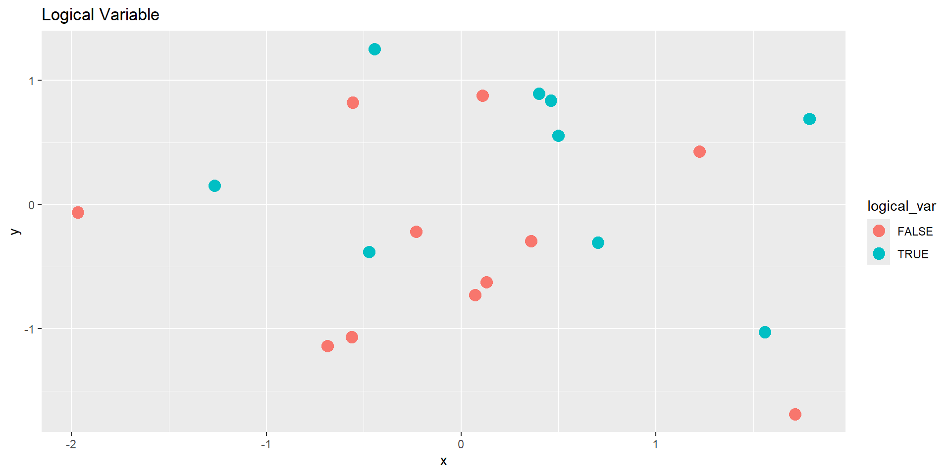
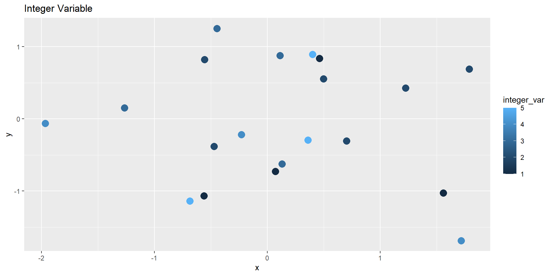
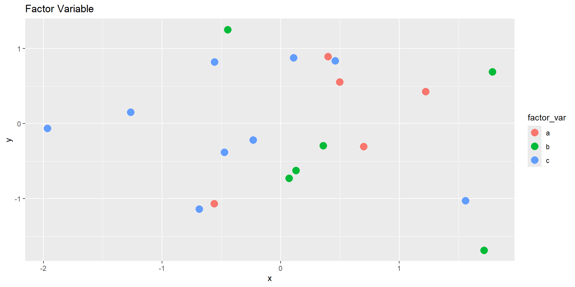
When you map a variable to the color aesthetic, ggplot automatically chooses colors depending on the data type of that variable:
Data Type
Default Color Behavior
Logical (TRUE/FALSE)
Two colors (discrete)
Integer / Double
Gradient (continuous)
Factor
Discrete palette
Character
Discrete palette
Demo Dataset
Let’s create a small data frame with several variable types.
            x          y logical_var integer_var double_var factor_var char_var
1 -0.56047565 -1.0678237       FALSE           1  9.7982192          a      dog
2 -0.23017749 -0.2179749       FALSE           4  4.3943154          c      dog
3  1.55870831 -1.0260044        TRUE           1  3.1170220          c      cat
4  0.07050839 -0.7288912       FALSE           1  4.0947495          b     bird
5  0.12928774 -0.6250393       FALSE           3  0.1046711          b      dog
6  1.71506499 -1.6866933       FALSE           4  1.8384952          b      cat
Mapping color to each variable:
# Logical (two-color discrete)ggplot(demo_df, aes(x, y, color = logical_var)) +geom_point(size =4) +labs(title ="Logical Variable")
Mapping color to each variable:
# Integer (continuous gradient)ggplot(demo_df, aes(x, y, color = integer_var)) +geom_point(size =4) +labs(title ="Integer Variable")
Mapping color to each variable:
# Factor (discrete palette)ggplot(demo_df, aes(x, y, color = factor_var)) +geom_point(size =4) +labs(title ="Factor Variable")
Activity: Customize the Color Scales
Recreate the plots, but use a color scale function to control the palette.
Experiment with both discrete and continuous color scales.
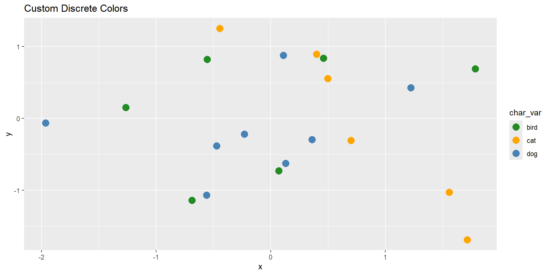
# Discrete manual colors for factor or character variablesggplot(demo_df, aes(x, y, color = char_var)) +geom_point(size =4) +scale_color_manual(values =c("cat"="orange", "dog"="steelblue", "bird"="forestgreen")) +labs(title ="Custom Discrete Colors")
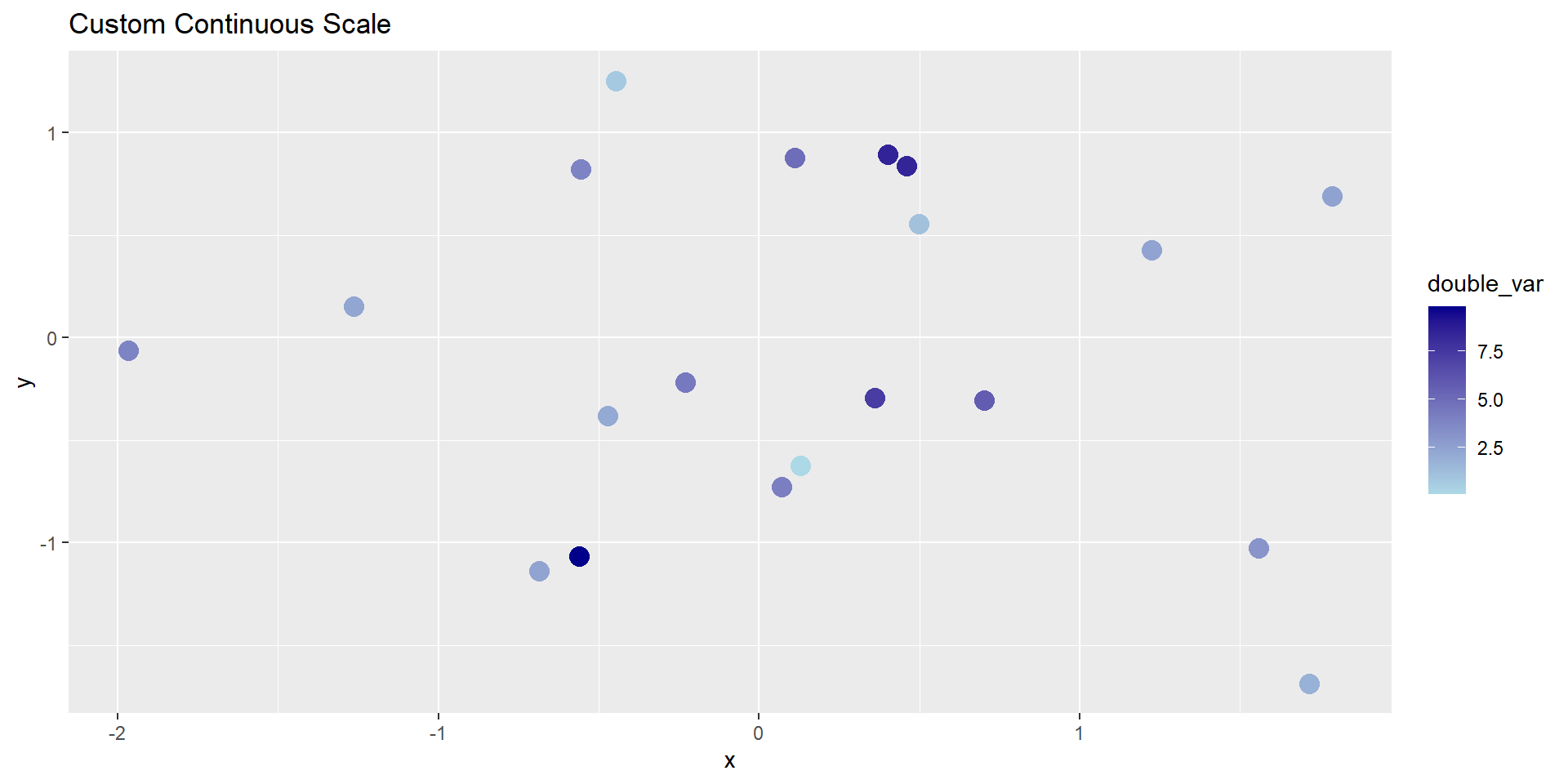
# Continuous gradient for numeric variableggplot(demo_df, aes(x, y, color = double_var)) +geom_point(size =4) +scale_color_continuous(low ="lightblue", high ="darkblue") +labs(title ="Custom Continuous Scale")
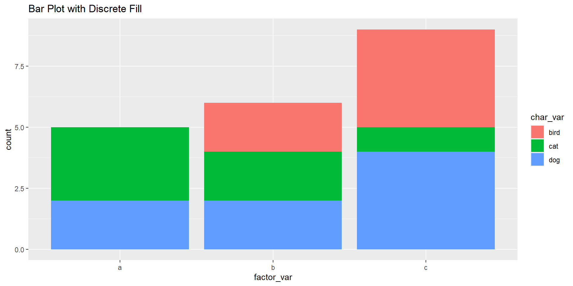
# Using scale_fill_discrete() with filled geomsggplot(demo_df, aes(x = factor_var, fill = char_var)) +geom_bar() +scale_fill_discrete() +labs(title ="Bar Plot with Discrete Fill")
Discussion
What happens when you map a numeric variable to color vs. a factor variable?
How can you control or standardize color use across plots?
When should you manually define colors rather than relying on defaults?
HW6 - Recreating
Article: Data About Covid Vaccine Supply and Demand (NYT)