Lecture 7
Color Part 3 - Design Considerations
Discuss in Groups of 2–3
Discuss the reading graphic:
Review: What data is shown? How is color used to encode ordinal, binary, or nominal data?
Praise: What’s one thing you liked about how the graphic portrays data?
Critique: What’s one change that would make it better?
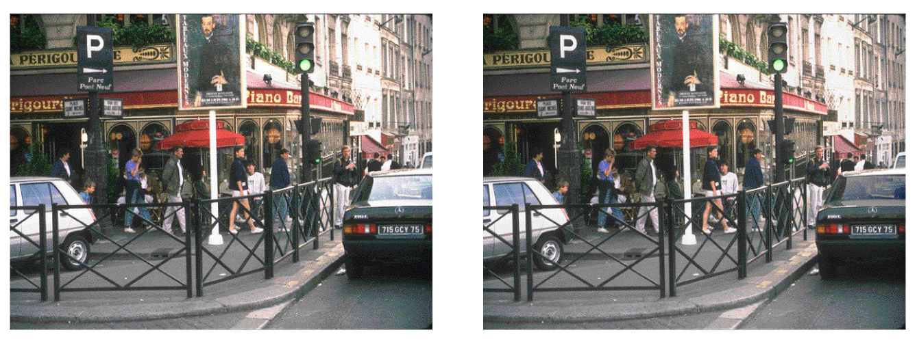
Ron Rensink’s Examples
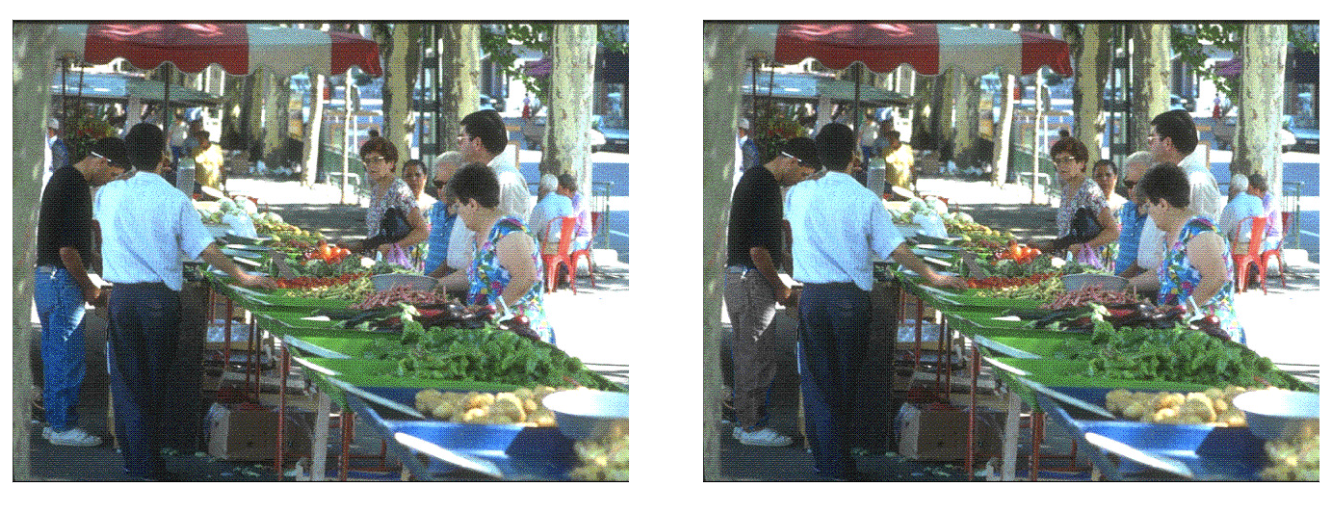
Ron Rensink’s Examples

Ron Rensink’s Examples
Prof. Sanchez’s Example

How the Visual System Works
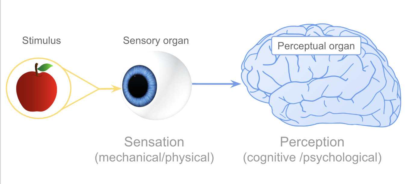
Visual processing has two components:
Eyes — image receptors
- Capture raw pixel information
- No interpretation yet
Brain — image processor + interpreter
- Imposes structure and meaning
- Fills in gaps, groups objects, detects patterns
- Decides what to pay attention to
Visual Memory: Three Stages
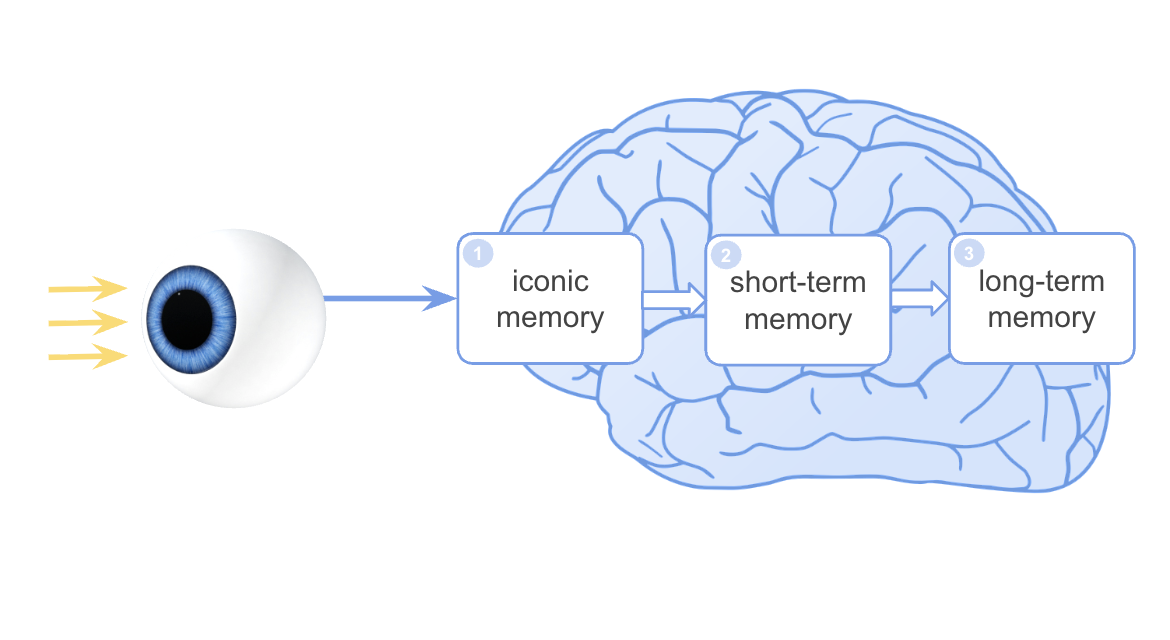
| Memory Type | Analogy | Duration |
|---|---|---|
| Iconic memory | Buffer / temp storage | < 0.5 sec |
| Short-term (working) | RAM | ~20 sec |
| Long-term | Hard disk | Permanent |
Good visualizations work with these limits — not against them.
The Power of Preattentive Processing
Can you count the 6s?
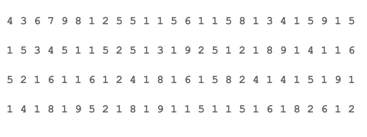
The Power of Preattentive Processing
Now try:

What changed? A single visual attribute, color, made the target pop out without counting.
This is preattentive processing at work.
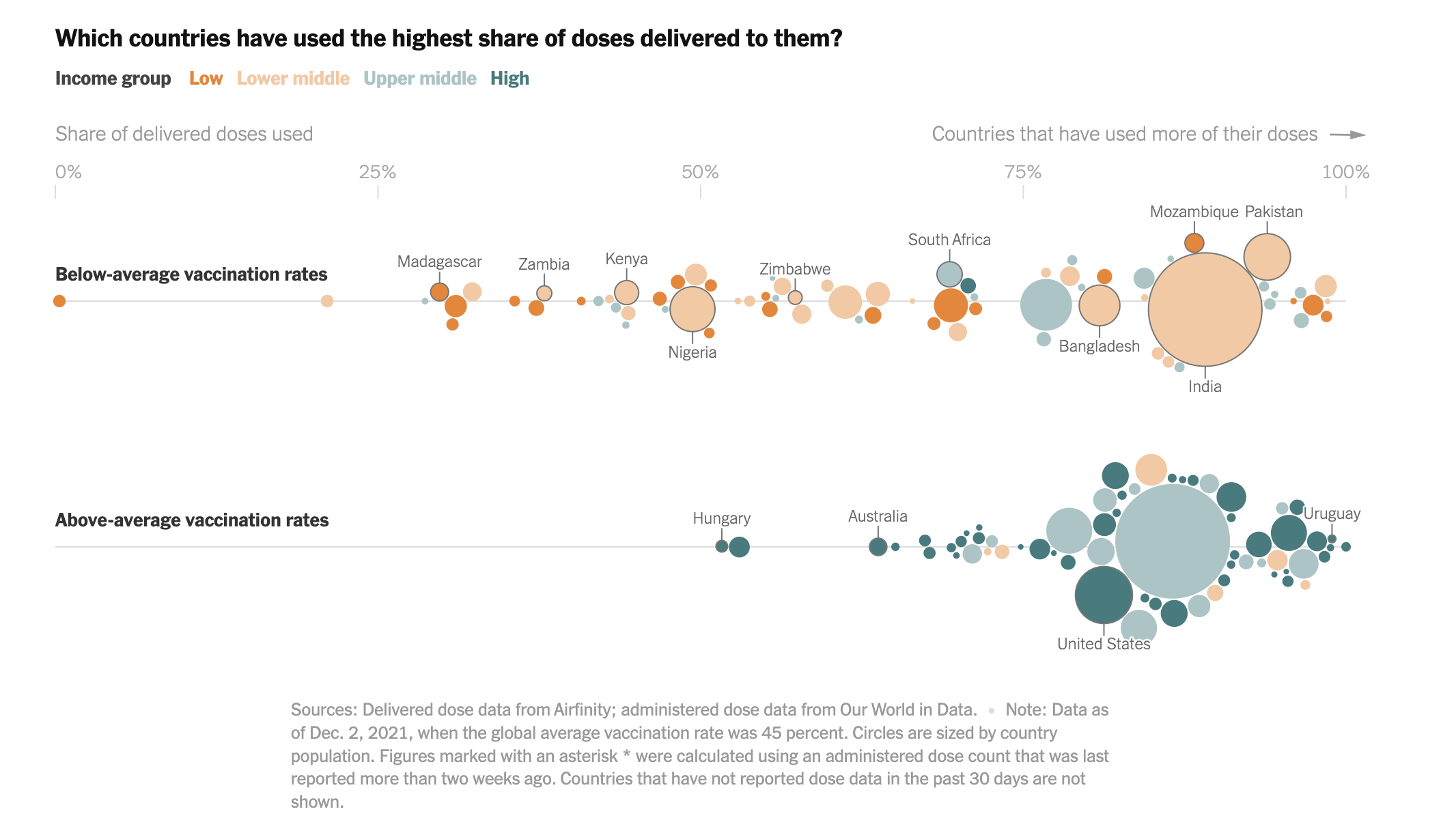
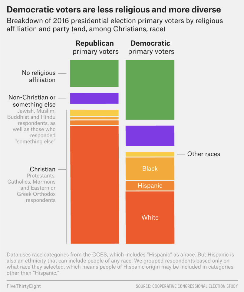
Why Democrats Struggle to Mobilize a Religious Left
Principle: Connectivity
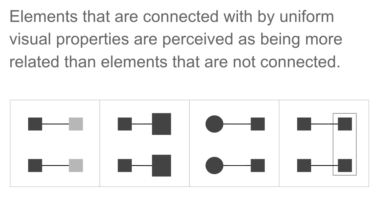
In dataviz: Lines in a line chart connect points across time. The connection implies continuity and relationship even though the data points are discrete.
Principle: Proximity
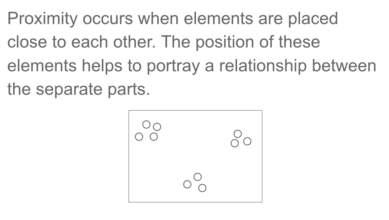
In dataviz: Grouped bar charts use proximity to show that bars within a group belong together (same time period, same category). Spacing between groups signals separation.
Principle: Similarity
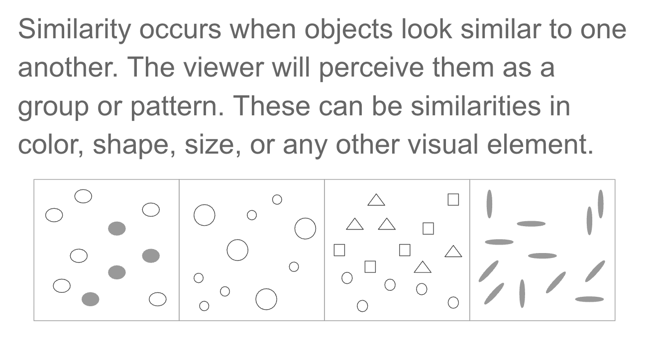
In dataviz: A consistent color for “Democrats” across all charts in a report uses similarity to signal the same category.
Bryce Harper May Already Be Past His Prime
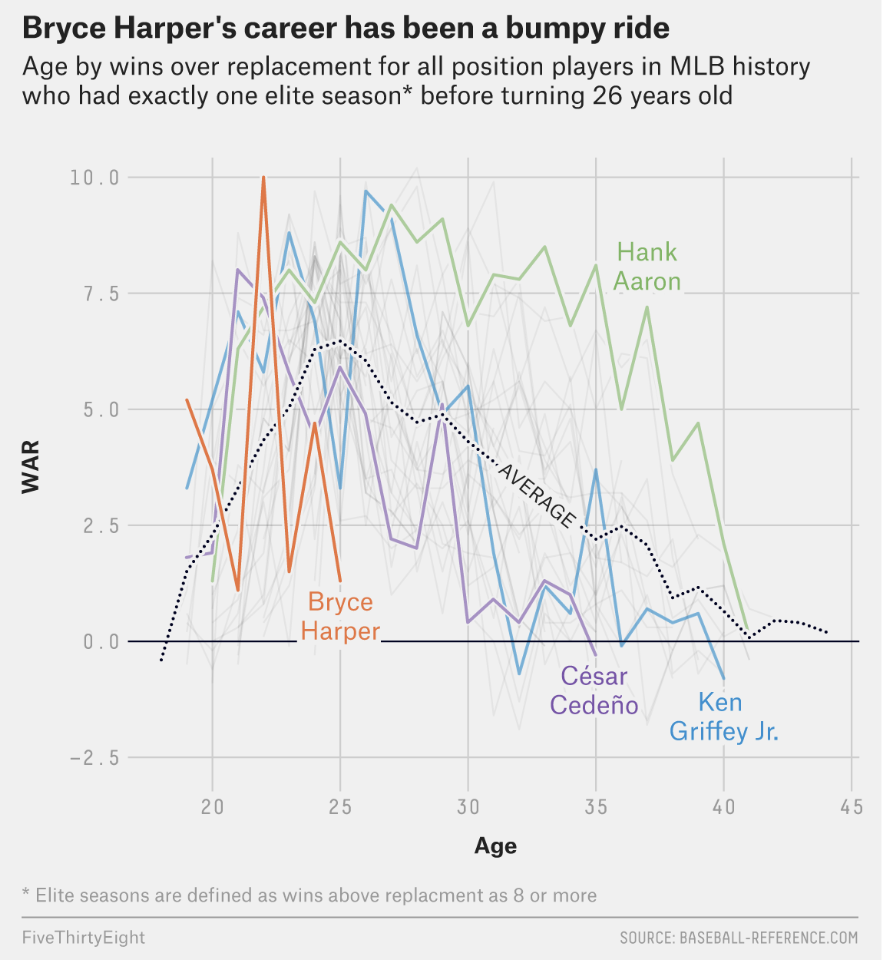
Principle: Continuity
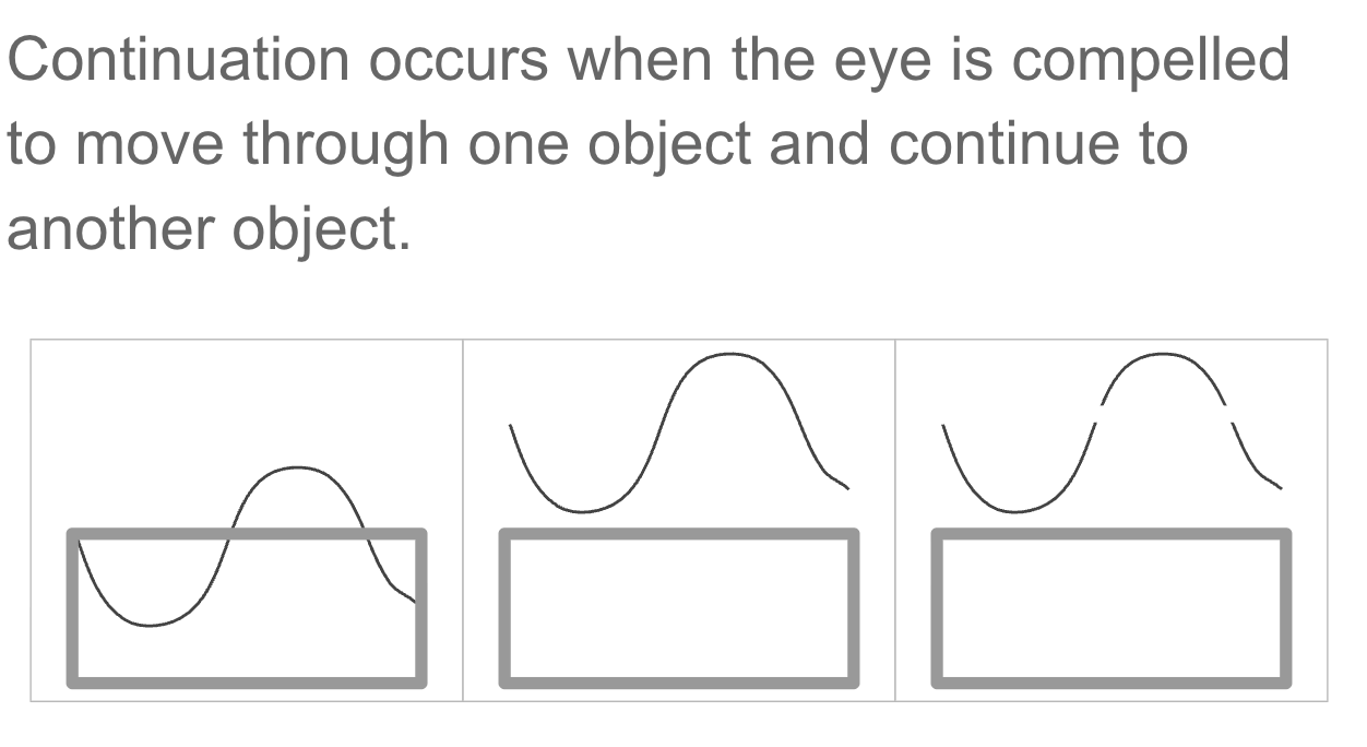
The eye follows the smoothest path through a series of points so we perceive a trend, not individual values, and this is why line charts are so good at showing trajectories
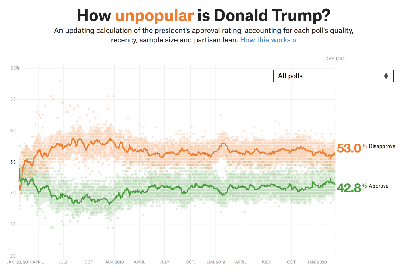
How Unpopular is Donald Trump?
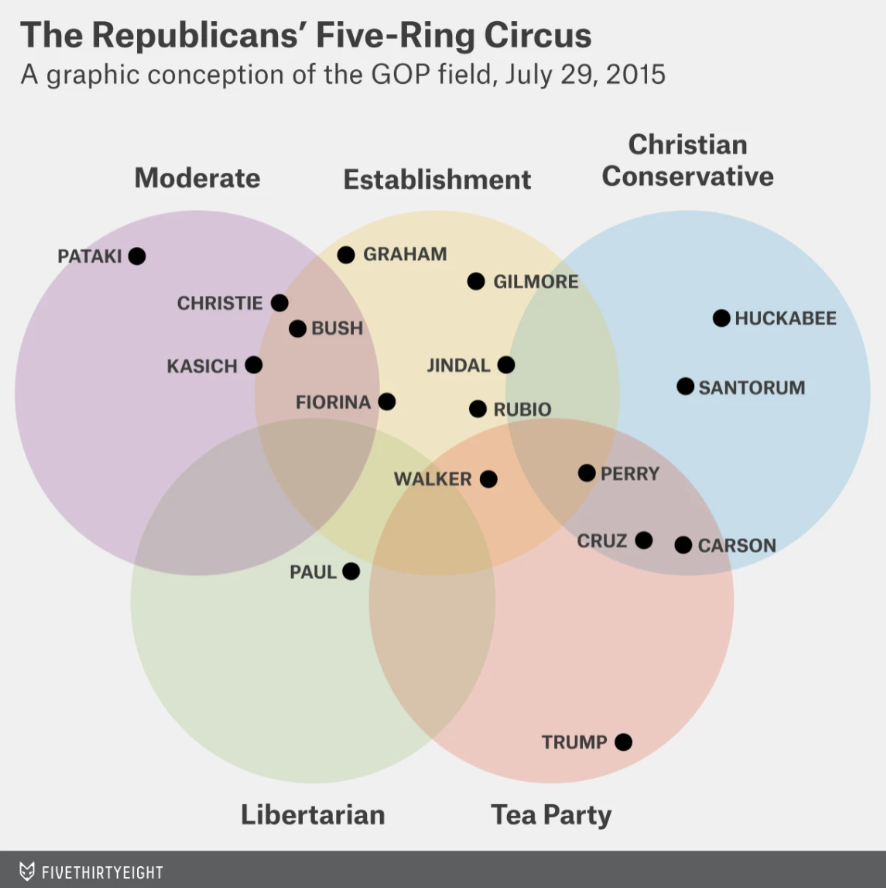
The 5 Corners of the 2020 Democratic Primary
Principle: Enclosure
Objects sharing a common region are perceived as belonging together.
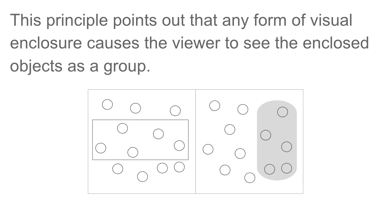
In dataviz: Shaded regions, background panels, and borders create groups without explicit labels. The boundary does the cognitive work for you.
Principle: Figure & Ground
We instinctively separate a “figure” (foreground object) from its “ground” (background).
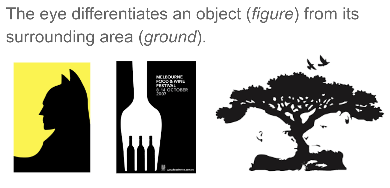
In dataviz: A white chart background is the “ground.” Your data marks are the “figure.” Gridlines should recede into the background, not compete with your data.
High-contrast accent colors push elements into the foreground.